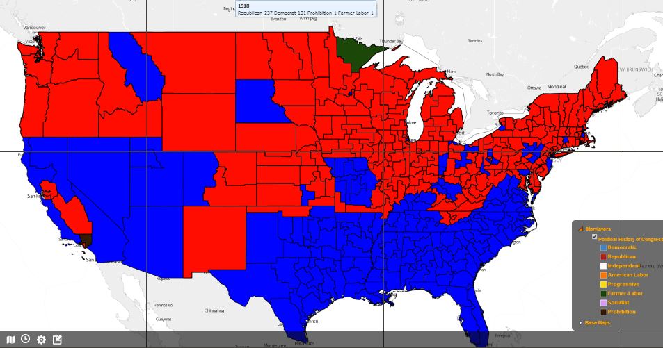
Are you curious to see a map of the U.S. light up in blue and red (and a few blips of yellow or green) in a time-progressed .gif of 100 years in American politics?
A research aide at Arizona State University’s Decision Theater, Jonathan Davis, compiled data on party control by Congressional district from 1918 to 2012, color coded it all, and animated.
The end result is a fascinating shortcut that describes the waves of political affiliation that have defined electoral politics over time.
What begins as a blue south and red north, becomes Swiss-cheesy by the mid-1960s. The South didn’t turn predominantly red, really, until the mid-1990s.
In Florida, the first red county appeared in Tampa Bay around 1956. Then the region reverted back to blue six years later while a red blip emerged on the Treasure Coast. The final Florida image appears Republican-leaning in all but a few spots. (But highly populated spots they are!)
And for the cynics among us who bemoan the polarizing we see between parties… just look back at maps from the early 19th century and wonder what THEY must have been thinking? Politically, at that time, the U.S. was essentially two different nations, one on top of the other.
Today’s polarization is a whole other animal. And, it seems, a far more complex and interesting one.